6 min read
Design tokens explained: a practical guide
Tokens are the contract between design and engineering. What they are, how to name them, and how to keep them from turning into a mess.
design systemstokenstheming

Product Design
Accessibility is not a phase at the end. Built into the system, it costs almost nothing and makes the product better for everyone.
TL;DR
Teams treat accessibility as a tax because they leave it to the end, where it turns into a retrofit: a pre-launch audit, a long list of failures, and a scramble to fix them under deadline. Done that way it is genuinely slow and genuinely painful, which is why so many teams do it badly or skip it. Move it earlier, into the primitives everything is built from, and it nearly disappears as a cost, because most of the work happens once and every screen inherits it. This covers how to hit WCAG 2.2 AA as a baseline your components guarantee, what the standard actually asks for in practical terms, how to split the work between automation and human review, and why the whole thing makes the product better for everyone, not just the people it is nominally for.
The shift
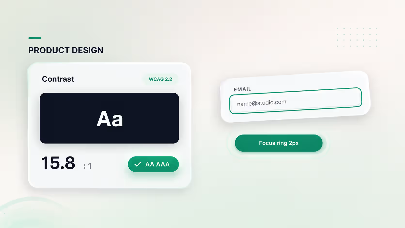
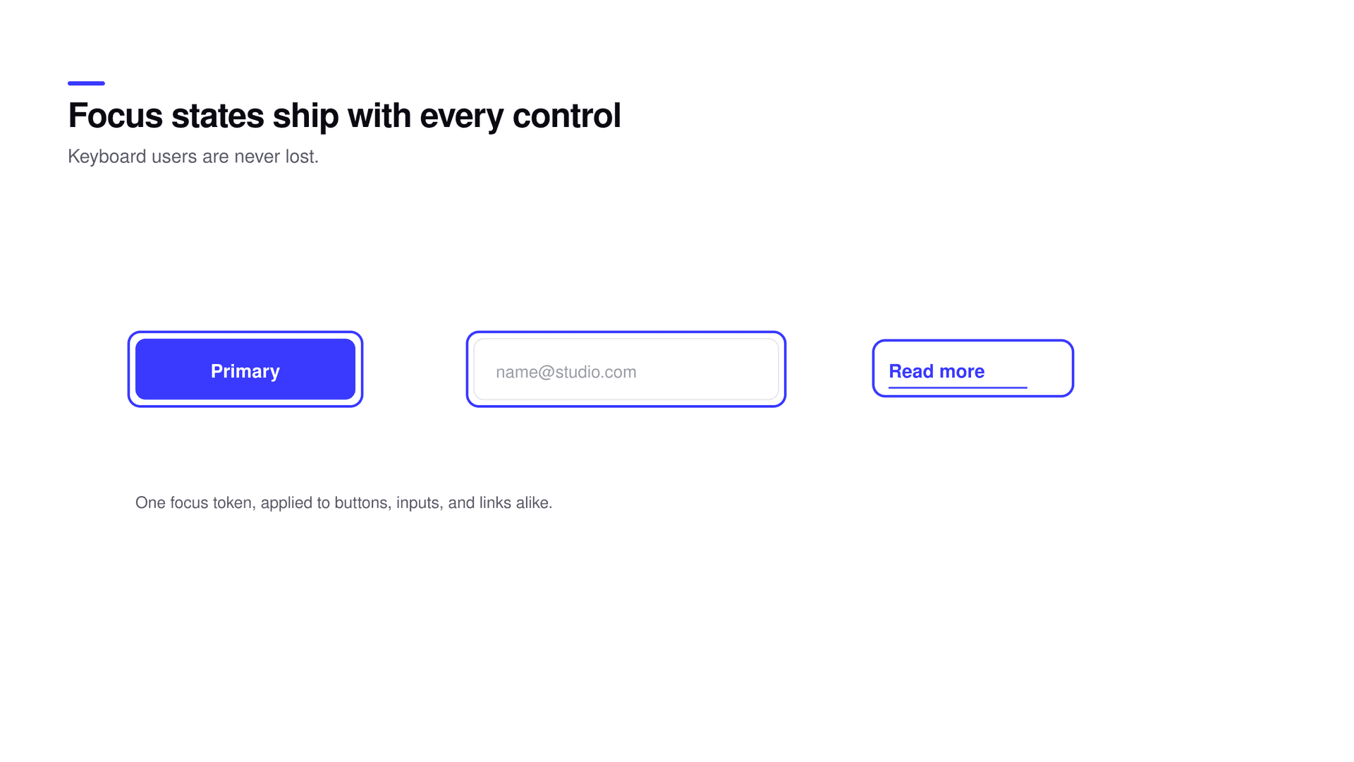
If the primitives are accessible, most screens are accessible without anyone thinking about it. Concretely, that means a few things built once. Color pairs in your token system that meet the required contrast by default, so unreadable text literally cannot be composed from approved tokens. Focus styles that ship with every interactive component, so keyboard users are never stranded with no idea where they are. Form fields wired to their labels and to error messaging as part of the component, not left to each page to remember. And target sizes that satisfy the standard built into buttons and controls. Do this once and the accessible version becomes the default version. The team stops choosing accessibility screen by screen because the components already made the choice, and a default that is hard to get wrong beats a guideline everyone means to follow.
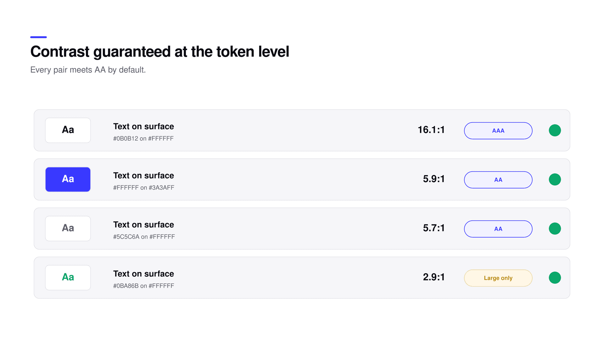
You do not need to memorize the specification to clear the common bar, because a handful of rules cover most of it. Normal text needs a 4.5 to 1 contrast ratio against its background, and large text 3 to 1. Every interactive element needs a visible focus indicator, and under 2.2 that focus must not be hidden behind a sticky header or other content when you tab to it. Interactive targets need a minimum size so they are not a pixel-hunt on a touch screen. Everything must be operable by keyboard alone, in an order that makes sense. And nothing important can be communicated by color alone, since a red dot with no label means nothing to someone who cannot distinguish it. Encode those few rules into your components and the large majority of AA is handled structurally, before anyone opens an audit tool.
| Requirement | Practical rule | Where it lives |
|---|---|---|
| Text contrast | 4.5:1 normal, 3:1 large | Token color pairs |
| Visible focus | A clear ring, never obscured | Component focus styles |
| Target size | A comfortable hit area on touch | Button and control sizing |
| Keyboard path | Everything operable, sensible order | Component behavior |
| Not color alone | Pair color with text or an icon | Status and error patterns |
The work splits cleanly into what a machine can judge and what it cannot, and the trick is to route each to the right place. Automated checks in your continuous integration pipeline, using a tool like axe, catch contrast failures, missing labels, and broken structure before code merges, which means those never reach a human reviewer at all. What automation cannot judge is whether the keyboard path is logical, whether a screen reader announces things in an order that makes sense, and whether an interaction is understandable without color. Keep a short human checklist for exactly those: tab through the whole flow with no mouse, listen to it with a screen reader once, check contrast on anything custom, and confirm nothing relies on color alone. Reserve human attention for the judgment calls and let the machine handle the rules, and accessibility stops being a launch-week event and becomes a property of every merge.
AA is the floor, not the trophy
WCAG 2.2 AA is the baseline your components should guarantee automatically. Spend your actual design judgment on the experience above it, not on re-earning the baseline on every screen. Passing the audit is the start of good, not the definition of it.
Accessible defaults are not a niche accommodation, they are the curb-cut effect in software, named for the ramps cut into sidewalks for wheelchairs that turned out to help anyone with a stroller, a suitcase, or a delivery cart. The same pattern holds on screen. Sufficient contrast helps everyone reading in bright sunlight, not only people with low vision. Clear focus states help every keyboard-heavy power user flying through a form. Target sizes large enough to hit reliably help every thumb on a moving train. Labelled forms help everyone filling one out while distracted or stressed. Captions help people in a loud room or a quiet office. Designing for the edges reliably improves the middle, which is why building the baseline into the system is a quality decision as much as a compliance one, and why the teams that do it tend to ship products that simply feel more solid.
Built into the system, accessibility stops being a phase with a cost and becomes a property of the product, the way performance or security is.
What is WCAG 2.2 AA?
WCAG 2.2 AA is the widely adopted baseline for web accessibility. It covers things like 4.5:1 text contrast, visible and unobscured focus indicators, minimum target sizes, full keyboard operability, and not relying on color alone. AA is the level most teams and many regulations target.
How do we do accessibility without slowing the team down?
Move it into the system. Put accessible contrast pairs in your tokens, ship focus styles and labels inside components, and automate mechanical checks in CI. Then most screens are accessible by default and the team only spends judgment on what tools cannot check.
What can automated accessibility tools not catch?
They miss judgment calls: whether the keyboard path is logical, whether a screen reader announces content in a useful order, and whether an interaction makes sense without color. Keep a short human checklist for those and automate the rest.
Does accessibility only help people with disabilities?
No. Accessible defaults are the curb-cut effect: high contrast helps in sunlight, large targets help on the move, clear focus helps power users, captions help in loud or quiet rooms, and labelled forms help everyone under stress. Designing for the edges improves the middle too.
Where should accessibility live in the workflow?
In the primitives and in CI, as early as possible. Contrast belongs in tokens, focus and labels belong in components, mechanical checks belong in continuous integration, and human review is reserved for keyboard and screen-reader judgment. Retrofitting at the end is what makes it slow.
None of this requires a specialist gatekeeper or a separate accessibility sprint. It requires accessible primitives, a short checklist for the human-judgment parts, and the discipline to keep the baseline in the components rather than in everyone’s memory. The natural home for that baseline is your token layer and the shared system between design and engineering. If you want WCAG 2.2 AA built into your product rather than audited into it at the end, it can be set up that way.
Related reading