6 min read
How to start a design system without over-engineering it
You do not need a hundred-component library on day one. Here is the minimum viable system that pays for itself immediately.
design systemsstartupsprocess

Design Systems
Tokens are the contract between design and engineering. What they are, how to name them, and how to keep them from turning into a mess.
TL;DR
A design token is a named design decision. Instead of a raw value like #3A3AFF scattered across a hundred files, you give the decision a name and reference the name everywhere. Change the value in one place and the whole product updates. That single idea is the foundation of every design system that scales past a handful of screens. This guide covers what tokens are and why they matter, how to layer and name them so they survive a redesign, how theming falls out for free once they are in place, how to migrate an existing codebase without a big-bang rewrite, and the mistakes that quietly turn a token system into a second mess to clean up.
The idea
Think about the difference between hard-coding a color and referencing a variable. The hard-coded value is a decision made once and then made invisible, repeated by hand wherever it is needed, impossible to change without a search-and-replace that will miss a few. The token is the same decision made once and kept visible and reusable. When the brand blue changes, you do not hunt through files hoping to catch every instance. You change the token, and everything that references it moves together. The payoff compounds in three directions. Consistency stops depending on whether everyone remembers the right hex and becomes structural. Theming becomes trivial, as shown below. And the token names become a shared vocabulary between design and engineering, which is often the quiet win that matters most, because a shared language removes a whole category of handoff confusion.
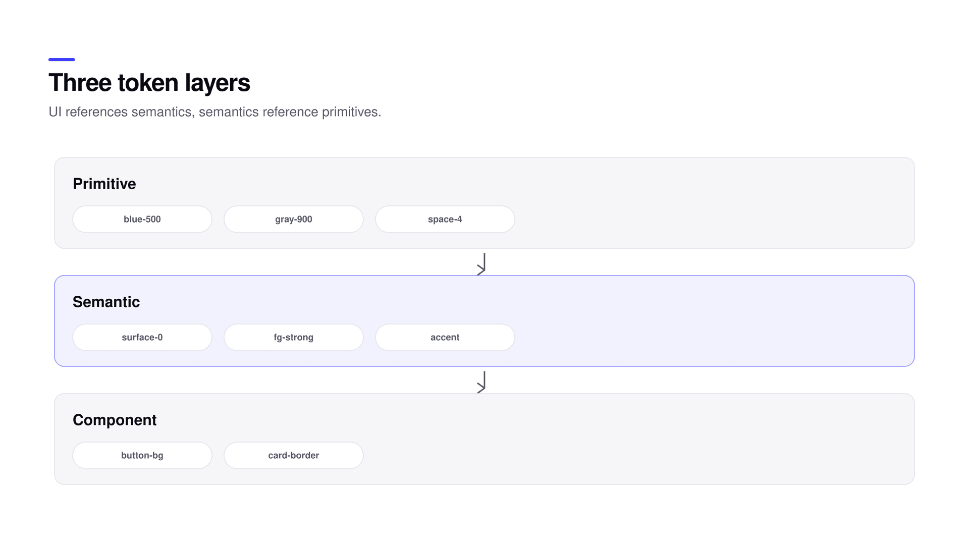
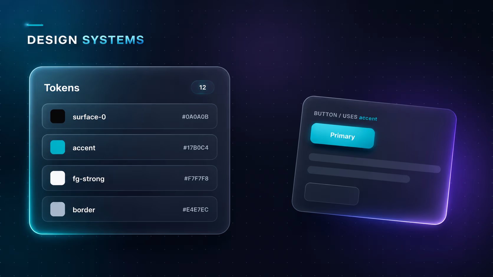
Most token systems fail because they are a single flat list, which forces every name to be either a meaningless raw value or an over-specific one-off, and neither scales. Layers fix this. Primitive tokens are the raw palette, blue-500, gray-900, space-4. They carry value and no meaning. Semantic tokens describe intent, accent, fg-strong, surface-0, border-faint. Your interface references these and never the primitives, so intent survives when the underlying palette changes. Component tokens are an optional third layer for a specific component that needs its own hook, like button-bg, and they reference semantics rather than primitives. The rule that keeps the whole thing clean is a single sentence: the interface references semantics, semantics reference primitives, and you almost never reach across more than one layer at a time.
:root {
  /* primitive: raw values, no meaning */
  --blue-500: #3A3AFF;
  --gray-900: #0C1220;
  --white: #FFFFFF;

  /* semantic: intent, references primitives */
  --accent: var(--blue-500);
  --fg-strong: var(--gray-900);
  --surface-0: var(--white);
}

/* component: optional, references semantics */
.button {
  background: var(--accent);
  color: var(--surface-0);
}
The one rule
Reference semantic tokens in your interface, not primitives. surface-0 survives a rebrand; blue-500 does not. If a component hard-codes a primitive, its intent is lost the next time the palette shifts, and you are back to hunting through files.
Good token names describe role, not appearance. surface-0 tells you where it goes. off-white tells you what it looks like today, which is exactly the property most likely to change and therefore the worst thing to encode in a name. Name by intent and the system reads like documentation, so a new engineer can guess the right token without asking. Keep the semantic set small and memorable. A dozen surfaces, foregrounds, borders, and accents that a designer can hold in their head will be used correctly; a hundred that nobody can remember will be ignored in favor of a hard-coded value that felt faster in the moment. Expand the set only when a real decision needs its own name, never speculatively, because every speculative token is a name someone has to learn for no payoff.
| Layer | Example | References |
|---|---|---|
| Primitive | blue-500, gray-900, space-4 | Nothing (raw value) |
| Semantic | accent, fg-strong, surface-0 | Primitives |
| Component | button-bg, card-border | Semantics |
Once the interface references semantics, a theme is just a different mapping of semantic names to values. Light and dark stop being two separate designs and become one design with two token sets. Define the semantics once, provide a value for each per theme, and every screen adapts without a single component changing. The same mechanism handles more than light and dark. A high-contrast accessibility theme is another mapping. A denser layout mode is another. A white-label brand for a client is another. In each case you change the values behind the names, not the markup that uses them, which is why a system built on semantic tokens can support variations that would be impractical to maintain as separate designs.
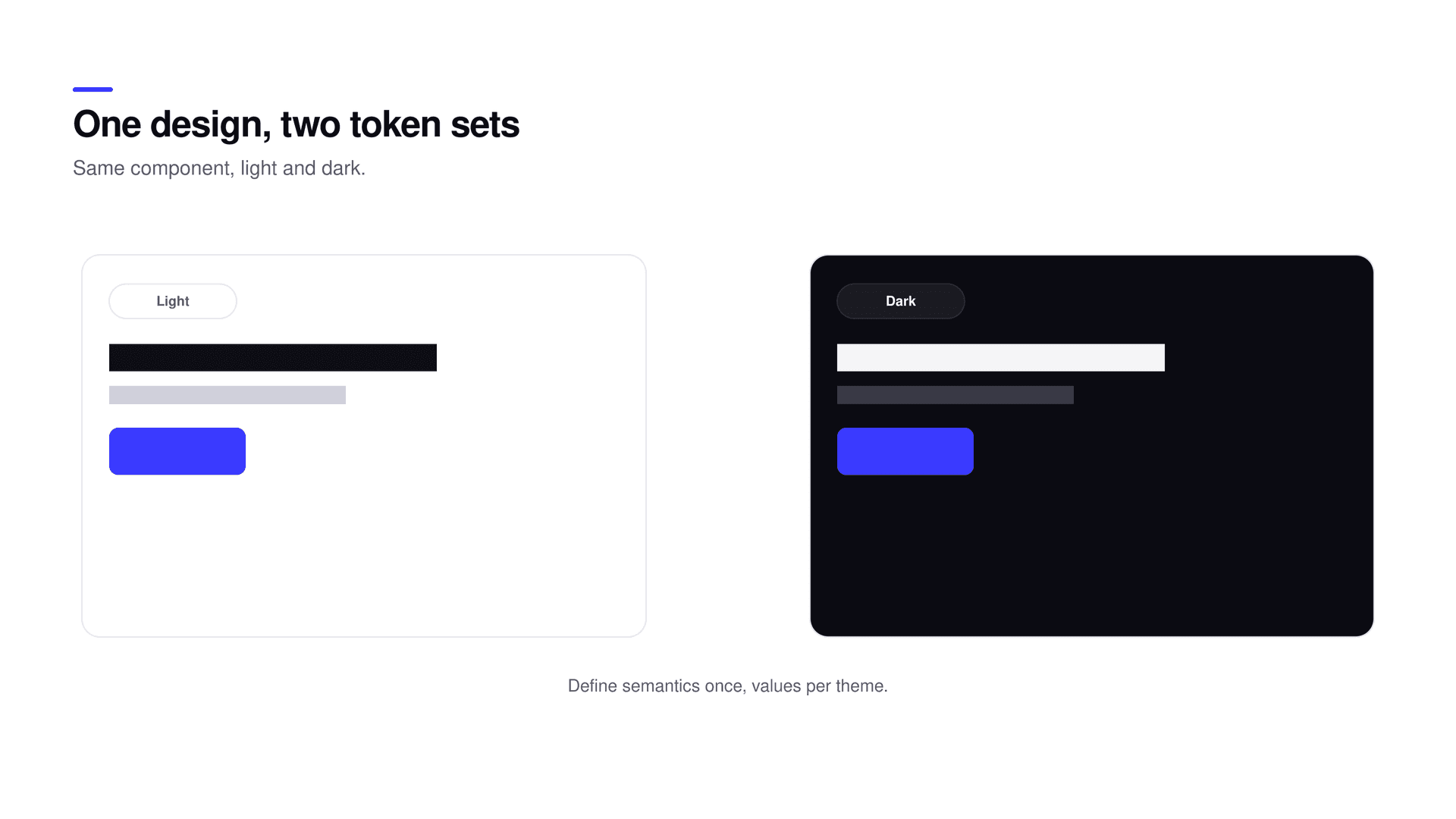
Most teams do not get to start clean. They have a product full of hard-coded values and no appetite for a big-bang rewrite, and they are right to be wary of one. The workable path is incremental. Start by defining the semantic layer for the values you already use most, color and spacing first, since they appear everywhere. Point those semantics at your current values so nothing changes visually on day one. Then adopt tokens in new work and in any file you are already touching for another reason, so migration rides along with normal development instead of competing with it. Leave the untouched corners alone until they come up. Within a few months the high-traffic parts of the product reference tokens, the risky rebrand is a config change rather than a search-and-replace, and you never had to stop shipping to get there.
Four failures recur often enough to name. Too many tokens too early, so a set no one can remember goes unused and the effort is wasted. Naming by appearance, so red-error becomes a lie the day the error color changes to orange and the name now actively misleads. Skipping the semantic layer, so components hard-code primitives directly and lose the entire benefit while looking, superficially, like they use tokens. And no owner, so tokens drift as everyone adds their own and nobody reviews, until the system is as inconsistent as the mess it replaced. Each one is a slow leak, and each is prevented by the same habit: a small, well-named semantic set with someone accountable for keeping it that way.
A design token is the smallest unit of a shared language between design and code. Get the names right and the system reads like documentation instead of a lookup table.
What is a design token?
A design token is a named design decision, such as a color, spacing value, or radius, stored once and referenced everywhere. Changing the token updates every place that uses it, which is what makes a design system consistent and easy to re-theme.
What are primitive, semantic, and component tokens?
Primitive tokens are raw values like blue-500. Semantic tokens describe intent like accent or surface-0 and reference primitives. Component tokens are optional per-component hooks like button-bg that reference semantics. Your interface should reference the semantic layer.
Should I name tokens by color or by role?
By role. surface-0 describes where it goes and survives a rebrand; off-white describes how it looks today and becomes wrong the moment the palette shifts. Naming by intent keeps the system readable and durable.
How do design tokens enable theming?
Because the interface references semantic names, a theme is just a different mapping of those names to values. Define semantics once, supply values per theme, and light, dark, high-contrast, and brand variants all fall out without changing components.
How do I add tokens to an existing product?
Incrementally. Define semantics for your most-used values, point them at current values so nothing changes visually, then adopt tokens in new work and in files you are already editing. The high-traffic parts convert within months without stopping shipping.
Start with a small, well-named semantic set, layer it correctly, theme through it, migrate incrementally, and let it grow by real demand. That is a token system that stays an asset instead of becoming the next thing to clean up. Tokens are also the first brick of a design system you start without over-engineering and the shared layer that lets design and engineering close the gap between the mockup and production. If you want a token system set up properly from the start, it can be built with you.
Related reading