5 min read
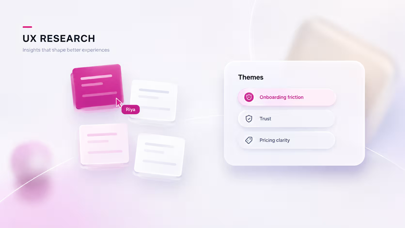
A lightweight UX research process for startups
You do not need a research team to make evidence-based decisions. A lean loop that fits inside a build cycle.
UX researchstartupsdiscovery

Product Design
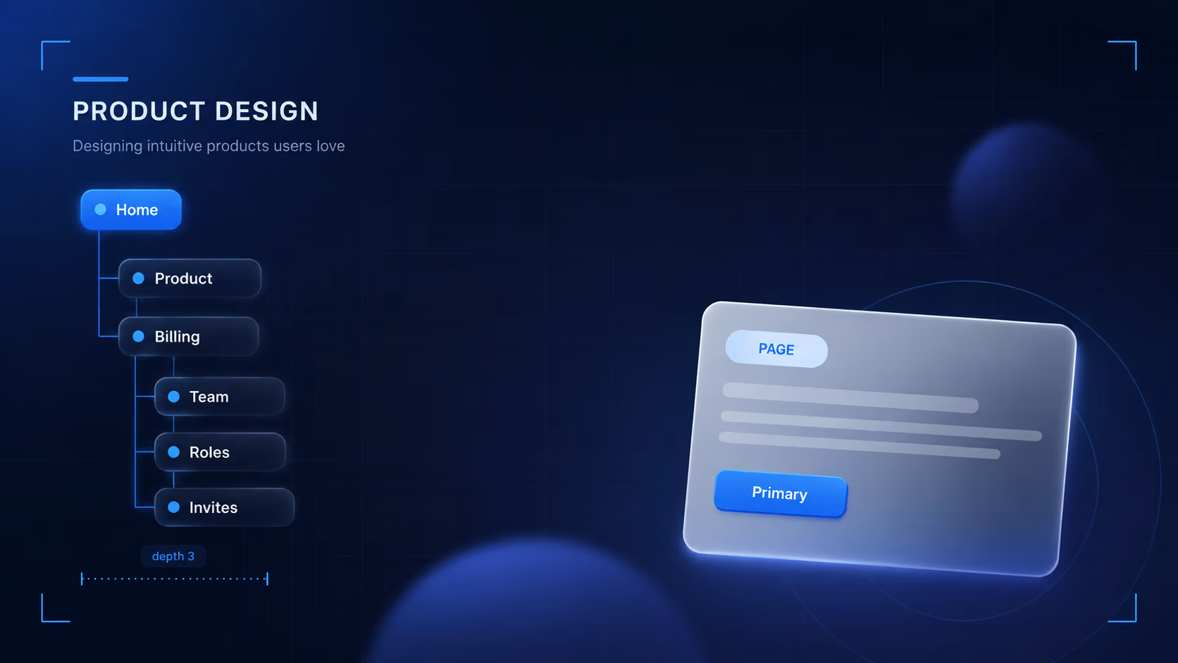
When a product has depth, structure is the feature. How to organize dense functionality so people can actually find and understand it.
TL;DR
Information architecture is the part of a product people never notice when it is right and never forgive when it is wrong. For anything with real depth, structure is the feature. It decides whether a powerful tool feels powerful or just overwhelming, whether someone masters it or abandons it after a frustrating week. When a product feels confusing, the cause is usually not the visual design or the copy. It is that the underlying organization does not match how the person thinks. This is a working guide to organizing dense functionality so people can find it, understand it, and trust that the map will not move under them.
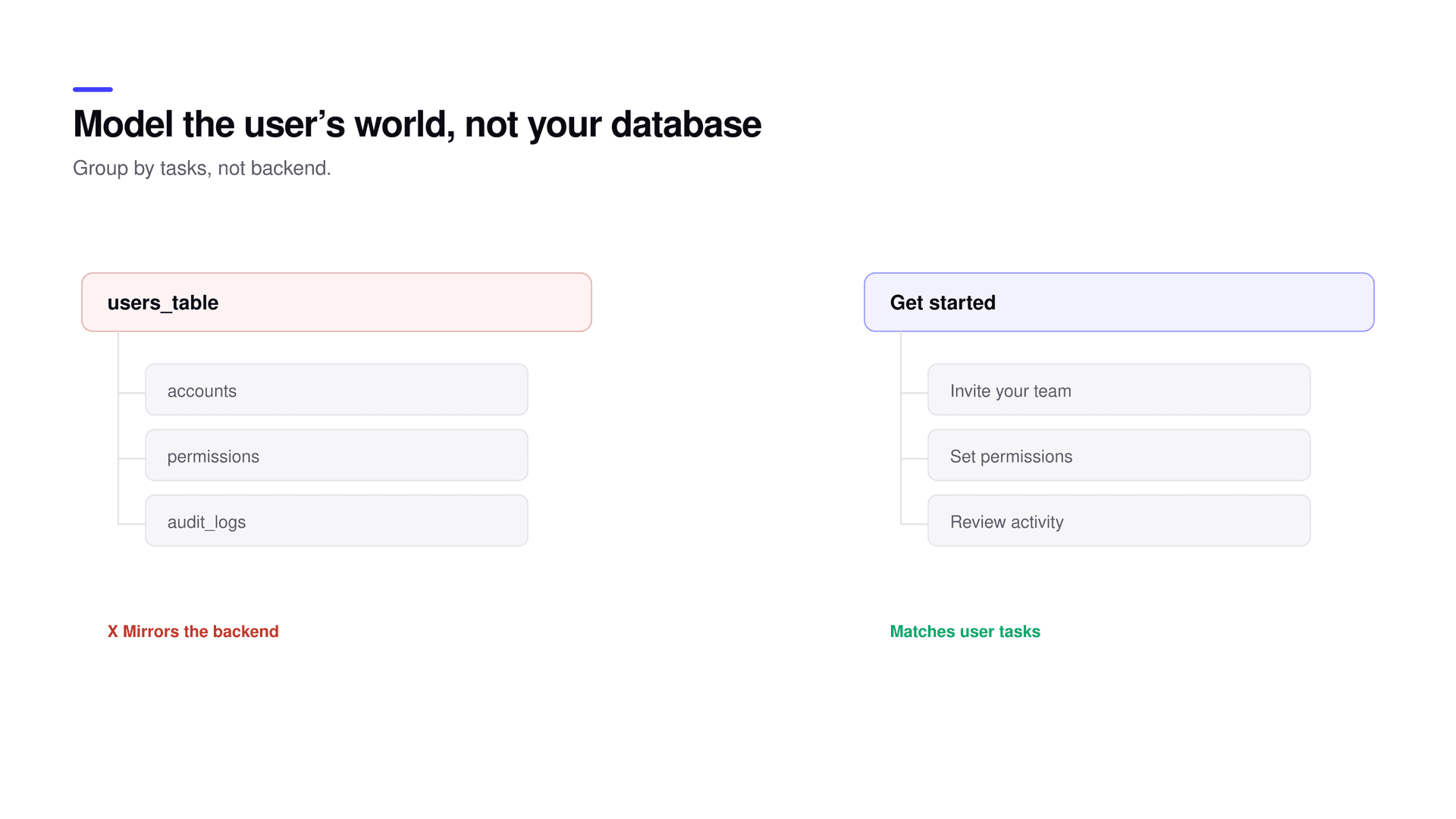
The most common failure is exposing the system’s structure to the person using it. The shape of the backend, the internal names for features, the way the data happens to be stored, none of that belongs in the navigation. Group by the jobs people are trying to accomplish, in the language they use for those jobs. A concrete example makes the point. A team once labeled a section "Subscriptions" because that was the name of the database table behind it. Their users were looking for "Plan and payment" and never connected the two, so support tickets for a feature that worked perfectly kept arriving. Renaming the section to match the words people already used, with no change to the underlying feature, cut those tickets sharply. The label was the whole problem.
This is why good information architecture starts with research rather than a sitemap. You cannot organize around someone’s mental model until you know what that model is, and you cannot guess it reliably from inside the company, because everyone inside already knows where things are and why. The internal logic feels obvious precisely because you built it. The person arriving for the first time has none of that context, and every internal name you expose is a small tax on their attention.
Complex products are not all shaped the same way, and the right pattern depends on the behavior you are supporting. A hub-and-spoke structure, a central home that branches out to focused areas, fits products people dip into for many small, unrelated tasks. A sequential structure, a defined order of steps, fits onboarding, checkout, and anything with a correct path from start to finish. A faceted structure, filtering a large collection along several dimensions at once, fits catalogs and libraries where there is no single right route and people arrive with different questions. Most real products combine two of these. A project tool might be hub-and-spoke at the top and sequential inside a setup flow. Layered on top of any of them, progressive disclosure, showing the common path first and tucking advanced options one level down, is what keeps a deep product from overwhelming a newcomer while still serving the expert.
Deep products need hierarchy, and hierarchy is not the enemy. The old rule that everything must be reachable in three clicks is a myth; people happily navigate several levels when they trust the map, meaning the structure is consistent and each step is obvious. What actually breaks trust is unpredictability. The same kind of object living in two different places, so people never learn which one is canonical. A section whose contents you cannot guess from its label. Navigation that reorders itself based on state, so the path someone learned on Monday is gone by Friday. Each of these teaches people, quietly, that the structure cannot be trusted, and once they stop trusting it they stop exploring and start relying on search and support instead. The fix is a small number of stable top-level areas, a predictable second level, and one consistent rule for where a given type of thing lives.
Name in the user’s words
A label that makes sense to the team but not the user is a dead end. Test names with a first-click test before building anything. If people cannot guess what sits behind a label, the structure has already failed, no matter how logical it looks on the whiteboard.
Information architecture is cheap to test and expensive to fix once shipped, which is the opposite of how most teams treat it. Three lightweight methods catch the majority of problems before a single screen is coded. A card sort, where people group your features the way that makes sense to them, surfaces the real top-level categories and often reveals that your internal grouping is not how anyone else thinks. A first-click test, where you show a label and ask where someone would click to do a task, tells you whether your names actually lead people to the right place; research on first-click behavior is blunt about the stakes, since people who get that first click right are far more likely to finish the task than those who miss it. A tree test, where people try to find a specific feature inside your proposed structure with no visual design to help, checks findability directly. Each takes about a day. Compare that to the cost of restructuring a live product: data migrations, everyone relearning where things are, and the trust you spend teaching people that the map they memorized is gone.
| Method | What it answers | Effort |
|---|---|---|
| Card sort | How people naturally group your features | About a day |
| First-click test | Whether a label leads to the right place | A few hours |
| Tree test | Whether people can find a feature in your structure | About a day |
Four mistakes cause most of the pain, and naming them makes them easier to catch in review. Mystery-meat labels that only make sense to someone who already knows the system. Duplicated homes, where one object appears in two sections and people can never predict which is the real one. Frequent tasks buried three levels deep while rare, impressive-sounding features sit up top because they photograph well in a demo. And shifting navigation, where the menu changes order or contents depending on state, so there is no stable map to learn at all. Every one of these is a small betrayal of the promise that the structure is trustworthy, and trust is the entire currency of navigation.
Put together, the work is smaller than it sounds. Start by interviewing a handful of real users about how they think about the domain and what they call things. Run a card sort to find the natural groupings. Draft a structure with a few stable top-level areas and a consistent rule for placement. Test the labels with a first-click test and the findability with a tree test, then fix whatever failed. Only then design and build. The whole loop fits in a normal sprint, and it replaces months of post-launch cleanup with a few days of cheap validation.
Good information architecture is invisible on purpose. You only notice it when it is missing, and by then the person has already given up and left.
What is information architecture in product design?
It is how a product’s features and content are organized, labeled, and connected so people can find things and understand where they are. In complex products it is often the single biggest factor in whether the product feels powerful or overwhelming.
What is the difference between a card sort and a tree test?
A card sort asks people to group items the way that makes sense to them, which helps you design categories. A tree test gives people your proposed structure and asks them to find specific things, which validates whether that structure works. Use card sorting to build the map and tree testing to check it.
How many levels deep is too deep?
There is no fixed number. People will navigate several levels when each one is predictable and clearly labeled. Depth becomes a problem only when the logic is inconsistent, so fix predictability before you try to flatten the hierarchy.
How should navigation items be named?
By the user’s task in the user’s own language, not by internal feature or table names. Confirm each label with a first-click test before committing to it in the build.
When should information architecture be tested?
Before you build. Card sorts, first-click tests, and tree tests are cheap on paper or in a prototype and expensive to act on after launch, when fixing structure means migrations and relearning.
Model the user’s world, choose a structure that matches how people navigate, keep the hierarchy predictable, name things in their words, and validate the map before committing code. Get it right and depth stops being a burden and becomes the thing that makes a product feel capable instead of confusing. Structure like this pairs naturally with a lightweight research loop to learn the mental model and a small design system to keep patterns consistent as the product grows. If a product has outgrown its own navigation, it can be restructured.
Related reading