6 min read
A prompting playbook for product designers
Prompting is a design skill now. A repeatable structure that gets useful output from AI tools without the guesswork.
AIpromptingworkflow

AI & Design
AI is not a magic button. It is a set of leverage points across research, exploration, and production. Here is exactly where we apply it, and where we deliberately do not.
TL;DR
AI does not replace the design process. It compresses the mechanical parts of it and frees up the hours for judgment, which is where the value was all along. That is the whole thesis, and everything below is the specific, repeatable version of it. The mistake most teams make is treating AI as one big feature, a single button that does design, and then being disappointed when the button produces something competent and forgettable. It was never one button. It is a set of small leverage points scattered across the process, each with a narrow job, each handing its result back to a person before that result counts for anything. Used that way, it makes a good team noticeably faster without making the work any cheaper to feel.
The map
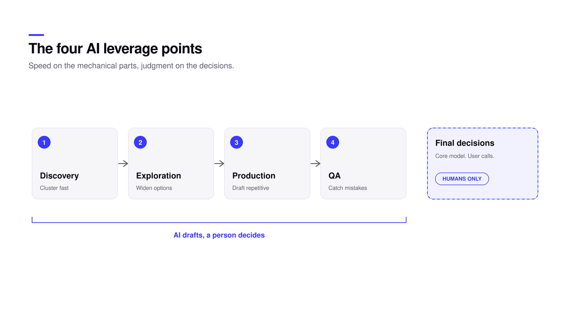
AI earns its place at four moments in the work: discovery, exploration, production, and quality assurance. Each one speeds up a part of the process that used to eat hours without adding much judgment. And there is one place it stays out of, deliberately, which matters as much as where it goes in. The sections below walk through each point with what the model does and what stays with a person, because the split is the entire method. Get the split right and you can use AI aggressively everywhere it helps without ever lowering the bar on the decisions that shape the product.
| Stage | What AI does | What stays human |
|---|---|---|
| Discovery | First-pass clustering of raw notes | Confirming each theme against real quotes |
| Exploration | Many rough directions, fast | Choosing and combining the right one |
| Production | Draft boilerplate, copy, and states | The core interaction and the details |
| Quality assurance | Flag mechanical, rule-based issues | Judging the experience |
At the start of a project there is usually a pile of raw input: interview transcripts, support tickets, sales-call notes, survey responses. Reading and grouping all of it by hand takes days, and most of those days are mechanical. A model can do the first clustering pass in minutes, turning a mess of quotes into a handful of candidate themes. Then comes the part that actually matters: reading the raw material yourself and confirming or killing each theme against what people really said. The model is a fast pattern-finder that gets you to a starting structure quickly. It is not the researcher, and treating it as one is how you end up confidently building on a theme that sounds plausible and that no real user would recognize, which is worse than having no theme at all. Every theme that survives has been checked against the source.
Early in design the biggest risk is anchoring on the first idea that half-works, because the first idea is comfortable and every idea after it feels like extra effort. AI is genuinely useful here precisely because it can generate many rough directions fast, and volume is the point rather than quality. Ask for a dozen throwaway takes on a layout, a flow, or a visual direction, exactly so you do not fall in love with the first one and stop looking. Then judgment takes over. Every output is a sketch to react to, not a design to ship, and you select, combine, and redraw from there. The model widens the space cheaply and the person closes it, which is the right division of labor. What never happens is letting the sheer volume of options stand in for a point of view about which one is actually right, because a hundred options with no opinion is just a bigger version of being stuck.
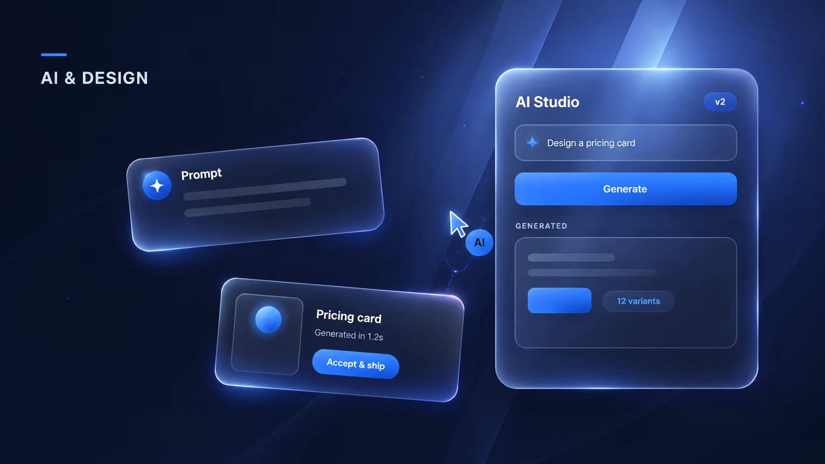
A large share of production work is mechanical: boilerplate markup, copy variants, the text for empty and loading and error states, alt text for images, the tenth minor variation of a component. None of it needs a human to start it, and all of it used to quietly eat real hours that were then not available for the parts that matter. Let the model draft these, then edit. The draft is rarely right on its own, but it is far faster to fix a draft than to face a blank state at four in the afternoon. The hours this frees are not deleted from the project; they move to the parts that actually need craft, the core interaction, the motion, the specific details a user will feel even if they never consciously notice them. That reallocation, dull work compressed so careful work gets more time, is most of the practical benefit.
Before anything reaches human review, run AI checks over it. Accessibility issues like insufficient contrast and missing labels, consistency problems like spacing that drifted or a token used wrong, copy that landed off-tone: these are exactly the boring, rule-based mistakes a model is reliably good at flagging, and exactly the mistakes a human reviewer wastes attention hunting for. Catch them automatically and human review is freed to spend its attention on the things only a person can judge, which is the entire reason to have a review in the first place. A reviewer looking for a missing label is a reviewer not thinking about whether the flow actually makes sense.
Rule of thumb
AI output is a starting point, never an answer. If a real user should have told you something, do not let the model tell you instead. Speed on the mechanical parts, judgment on the decisions, and never confuse the two.
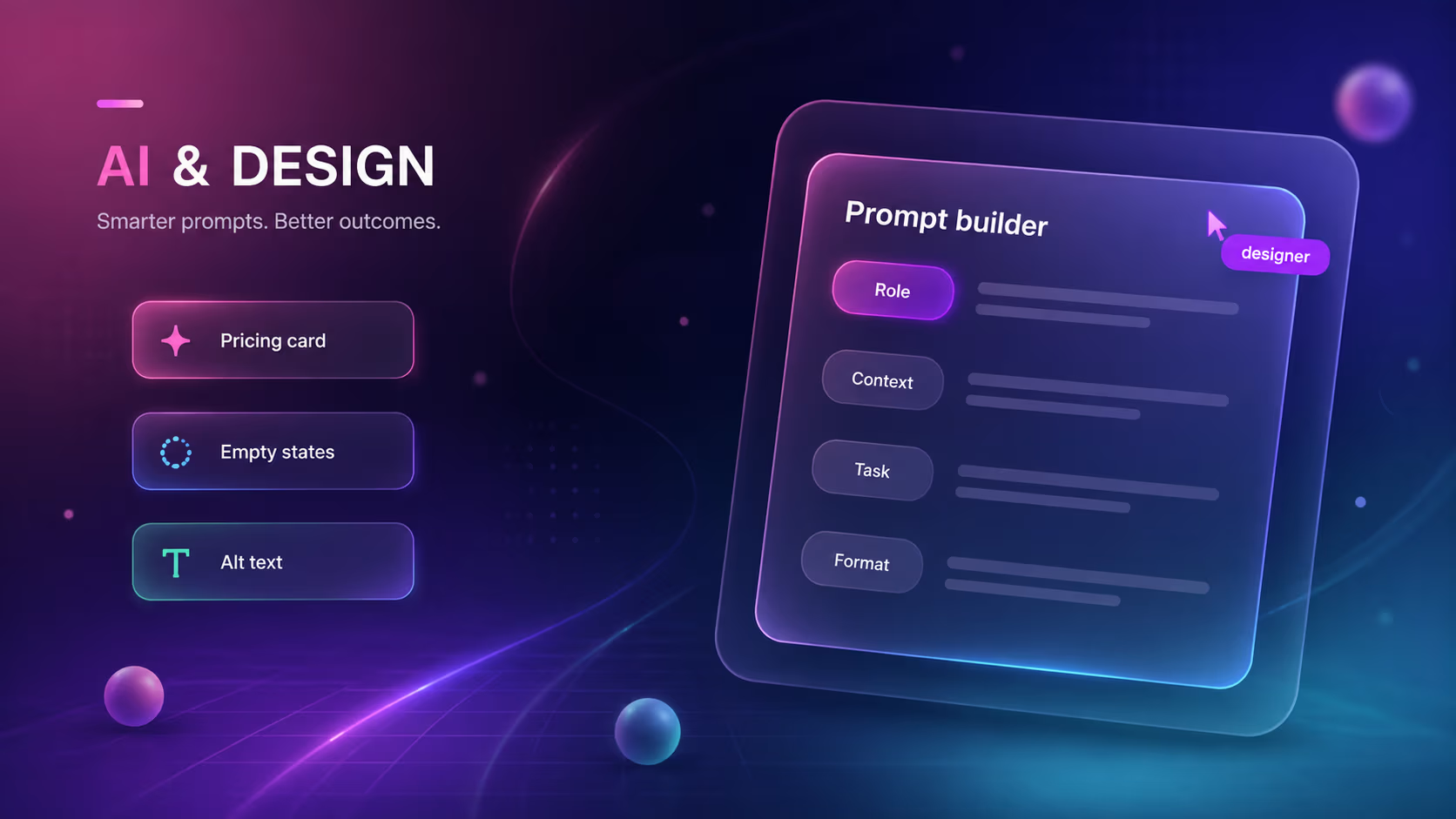
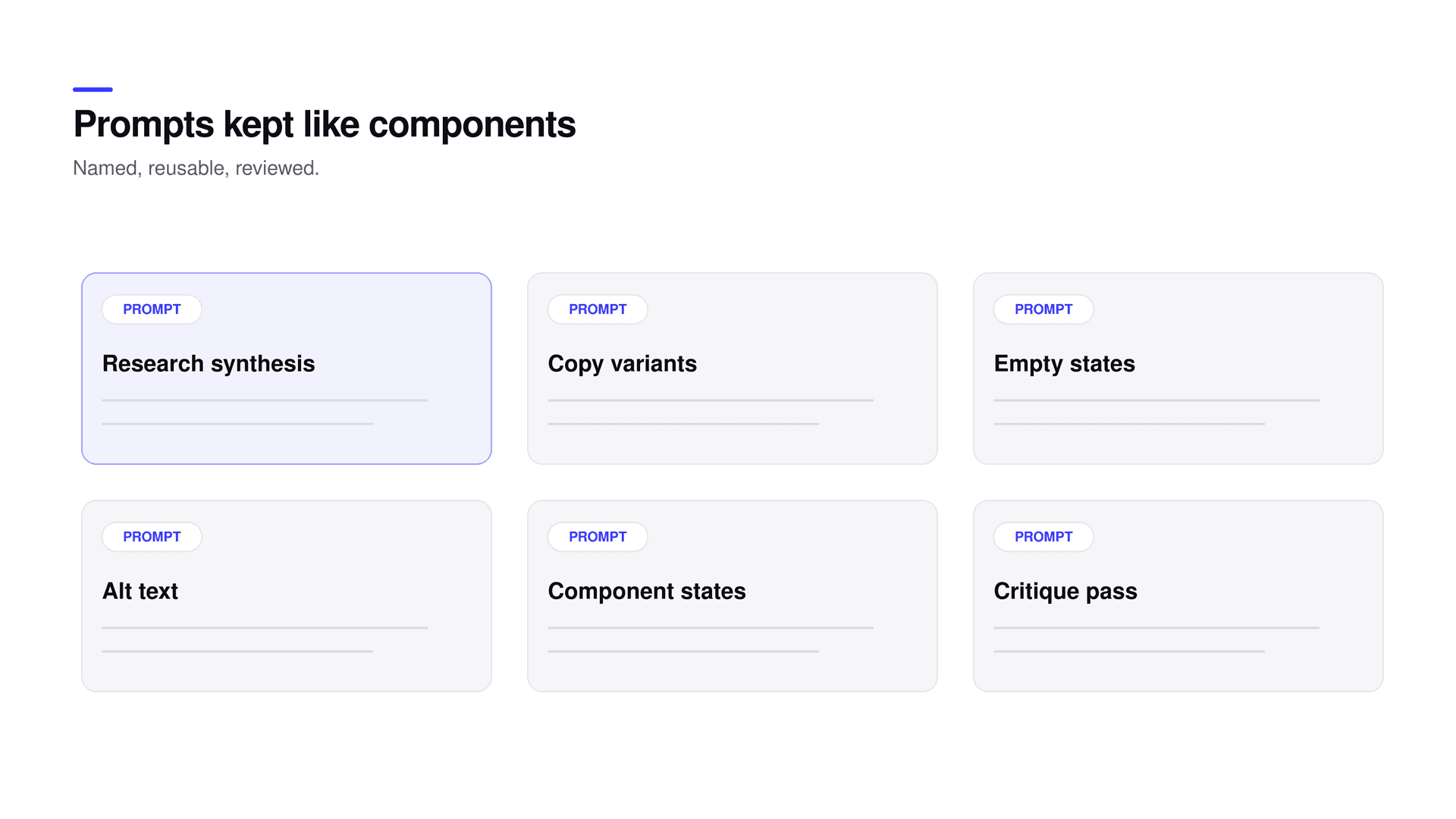
The last piece is not a moment in the process but the thing that turns individual wins into a team capability. When a prompt reliably produces good drafts, save it, name it, and reuse it like a component. A small library of proven prompts, for empty states, alt text, copy review, and exploration, means the team compounds its leverage instead of re-solving the same request every week from scratch. It also spreads a good approach from whoever discovered it to everyone else, which is how a practice becomes a standard rather than a personal trick. The prompting playbook covers how to structure those prompts so they are worth saving.
Everywhere above, AI produces a starting point and a person makes the call. That order never reverses. Final decisions, the core interaction model, and anything a real user should have validated stay with people, without exception. The reason is not caution for its own sake. It is that the model is confidently wrong often enough that trusting its output as an answer is only a matter of time before it costs you something real. Treating every output as a draft is precisely what makes it safe to use AI aggressively everywhere else, because the mechanical speed never gets to make a decision it is not qualified to make. That judgment, the part that cannot be automated, is the reason a good product still stands out when anyone can generate a competent screen in a minute.
The result is not fewer designers. It is judgment applied to more of the work, because the boring parts stop eating the week.
Does AI replace designers in this workflow?
No. AI handles the mechanical parts, first-pass clustering, rough exploration, boilerplate drafts, and rule-based checks. Every decision, the core interaction, and anything a real user should validate stays with a person. The output is a draft the designer edits, never the final answer.
Where should you not use AI in design?
On the decisions. Keep it out of the final call on direction, the core interaction model, and anything a real user should have validated. That is where confidently-wrong output does the most damage.
How do you keep AI-assisted work from looking generic?
Use AI only to widen the option space and draft the mechanical parts, then apply human judgment to choose, combine, and craft. The average is the model’s default; pulling away from it is the designer’s job.
What is the fastest place to start with AI in a design team?
Production drafts: empty and error states, alt text, and copy variants. They are low-risk, high-volume, and easy to verify, and saving the prompts that work builds a library that compounds.
Does using AI make the work cheaper?
It makes it faster, not cheaper to feel. The hours saved on mechanical work move to the parts that need craft, so the product gets more attention where it matters rather than less investment overall.
None of this is exotic. Four narrow places where a fast, tireless assistant removes mechanical drag, one shared library that makes the wins compound, and one hard line where judgment stays human. Run it that way and a good team becomes a faster one without the work getting any cheaper to feel. For the judgment this protects, read why taste is the moat; for the craft that has to survive the handoff, design engineering. If you want a team that already works like this, start a project.
Related reading